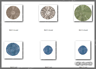
I haven't had a whole heap of time today. Other stuff needed to be ticked off my lists and well, Wednesday is visiting 'Aged P' time. However I have at least made a start on the next paper. I'm not thrilled with it so far and it may well not make it any further but it's the progress for today.
I'll look at it afresh tomorrow and see if it can be improved or not.
Px
Wednesday, 6 March 2013
Tuesday, 5 March 2013
Papers One, Two, Three & Four
Cracked on with the project today. No interruptions (well, not many). So without further ado...
Here's paper one again with an ever so slight alteration. I redesigned the dots to a 'half-drop' format so they look as if they run diagonally rather than horizontal.
This is a result of playing around with the filters in Photoshop from the dots in the first version of Paper One. By using the 'Maximum' filter, the dots transformed into rounded squares. I inverted the effect, so I could use the gridlines instead and placed them onto a blue background.
And onto the stripes. I created a striped pattern, placed it over the dark maroon background, added some texture and it was good to go. Another design under my belt.
Finally, for today, I created a Damask style pattern. Phew! I'm now more than halfway to my Sunday commitment.
Px
Monday, 4 March 2013
Paper One
Well, today's prompt was to make a weekly commitment. Apparently there'll be four of them occurring on each Monday for this challenge. So I pledged that by 8pm on Sunday, I'd have completed six designs. If I can do any more, then perfect. And my reward for meeting my commitment is to buy a Big Blue bath bomb from Lush & have a nice long soak in the tub on Sunday evening with it.
Anyway, back to today.
I figured that just to get the ball rolling, I'd start with a simple design. Dots. Believe me, when you know how, this pattern can be knocked out within seconds.
And though I thought I'd be able to make this design within minutes, it proved to be otherwise. Thing is, I didn't just want to add dots over the textured background. I wanted to add a few subtle textures and fades into the design, behind and in front of the pattern, to give it more oomph and substance. And that took me quite a bit of faffing around until I had what I thought was an acceptable design.
But at least I have one paper now ticked off. Tomorrow I plan to create another simple design and hope to be a bit quicker about it.
Until next time
Px
Sunday, 3 March 2013
Circular Blobs
Again, being a busy weekend, I've not had time to play very much but I did muck about with some images. I'm not happy with any of them yet but it's all I've done. Some days, it just doesn't click and today's one of those days.
You never know, i may wake up tomorrow and have an inspired idea on how to use them but if not, they could be headed for the bin.
Anyway, that's all I have to show for now. Hopefully tomorrow will bring a more productive output.
Px
You never know, i may wake up tomorrow and have an inspired idea on how to use them but if not, they could be headed for the bin.
Anyway, that's all I have to show for now. Hopefully tomorrow will bring a more productive output.
Px
Saturday, 2 March 2013
Small Blocks of Time
Today's advice from the group was about working on your project every day even if you don't have a whole heap of time. Very apt as today is one of those where being short on time rings true. And as much as I snorted at the idea of only doing a few minutes worth, I felt I should give it a go before dismissing it.
So I opened up my two texture files and saved each in all the different colours. I then imported these into my progress sheet from yesterday. And I discovered that I'd neglected to add the lighter violet colour. So I rejigged again and now there are three of each shade in a combination of the two textures.
It may not be a giant leap forward but it's progress nonetheless which is what today's prompt was all about.
Until next time
Px
Friday, 1 March 2013
And I'm Off
Yes it all kicked off yesterday afternoon. The community website was opened up and we all poured in to add our project challenges and commit to seeing them through. I'm supposed to spend at least 20 minutes a day on it but it's taking me a lot longer to just create a small part.
Anyway, I'll share, as promised, my progress for today. I've began by creating an InDesign Document in which to place finished paper designs. And initially, I'm also using it as a guide to show many of each prominent colour to produce.
However, the main play for today was in creating textures. Something which should be very easy to do. I can happily create plenty of textures, knocking them out in minutes, so I didn't forsee any problems. However, when I laid the two different textures over the same colour, one came out a very different colour to the other. It took quite some fiddling in Photoshop to fine tune both textures so that they kept the same tones.
Hopefully, I've sorted it but judge for yourselves...
They are both quite subtle. They are going to just gently add something to the background before I add the rest of the design. If I want a more dynamic texture, I can add this over the top. But at least I have something to show today.
And just one final thing. I made a cool brush from a vintage image in a book page. So I've added it here to show how it might look.
Right that's all for today. I'm going to be busy tomorrow so I may use it as my one day off. But we'll see.
P
Thursday, 28 February 2013
A Little Preparation
Okay, so it's a bit early to start posting but it's only a little preparation before the whole shebang kicks off. So I'm going to let it count. Besides, it has taken me nearly four days just to make one singular decision. The colours I'll use. I have been through quite a few ideas and frustrations before coming up with a scheme I''ll hopefully remain happy with.
I've trawled through many photos and inspiring websites. I've sampled colours from all kinds of sources and yet remained indecisive. So this morning, I saw this beautiful collection of fabrics by Holly Taylor Designs, called The Enchanted Pond.
I love the rich jewel colours here. Much brighter than the usual desaturated tones I'd been playing with. It inspired me to start looking at a richer, darker palette.
Using the photograph, I did away with the green because I wanted a blue to sit alongside the violet colour. The brown, which was a perfect accompaniment to the green, was therefore redundant. I replaced it with a mustardy yellow, as gold goes really well with the purples and violets. It was still a little intense for my preferences, so I desaturated the whole palette a notch. There was a dark and light colour for all but the red-violet so I added a lighter hue from it, to the mix.
I then sampled the colours and finally I feel I have a selection of I can start playing with. All I had to do was give it a name. It didn't take long for it to pop into my head. Veronica Frannie.
So there you have it. With a huge chunk of inspiration from a quilting bundle by a professional designer (thank you Holly), I have begun the process to creating the Veronica Frannie Collection.
Until Next Time
h&k
Px
Subscribe to:
Posts (Atom)


